Pops of Color at Lark & Lola House
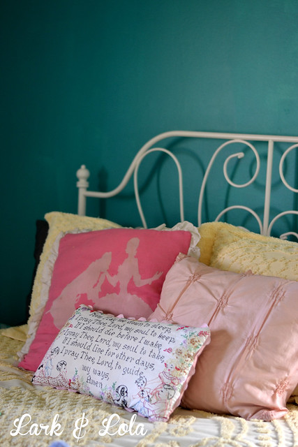
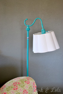
When I picked our master bedroom paint color, the Lola inside me was screaming, "Nooooo! Don't do it!!!" While the Lark side of me was grinning mischievously and egging me on, "Do it. Do it! You know you want to." Sometimes I'm glad I listen to Lola, but this time I was glad I listened to Lark. Check it out. TEAL.
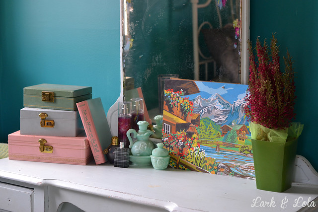
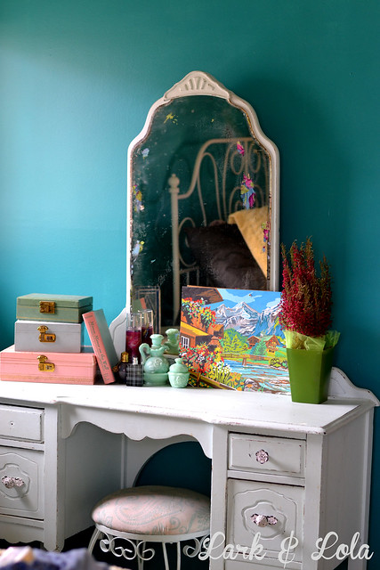
One thing I learned last year while reading decorating blogs: paint color should almost always be your last choice when decorating. While I knew I wanted Seal Gray for our living and dining area, partly because I already knew of my colorful decor that would be furnishing those rooms, the master bedroom was troublesome to me. I have that light blue antique vanity. Then there is the yellow chenille bedspread. Our green and blue area rug, dark floors...what would be the best paint color for all this?
Finally, I remembered how lovely yellow and teal look together. In fact, I've long had an entire Pinterest board dedicated to "Teal & Yellow". I knew that teal would look awesome against the light blue vanity. I imagined the color: like the darkest shade in the shadows of those antique blue Mason jars. Yes!
Also, I love navy paint, and that's the hottest new color to paint, it seems. I almost chose navy for this room. But I knew teal would look better.
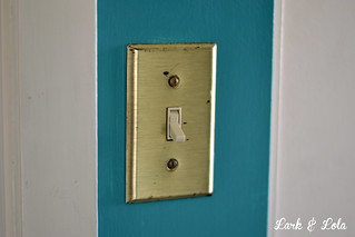
I've also recently learned, much to my surprise, that brass is making a big come back. Not like the shiny gold/yellow brass that was in for a while in the 1990s, this time we're seeing antique, brushed brass. The more patina, the better. Old brass. Our master bedroom was the one room in our new home that was fitted with brushed brass outlet and light switch plates. I cringed when I first saw them and ever since...until I saw how they shine against my new teal paint. Now? I love them. Me? love something brass? Well, shoot.
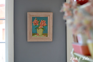
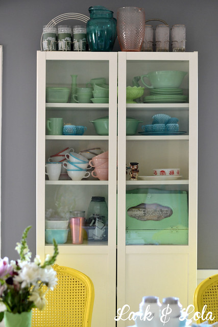
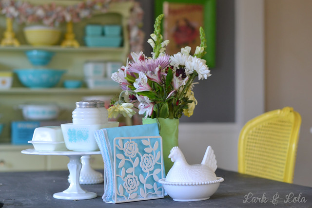
 Between the gray walls, the white trim, and all this new-found LIGHT we're enjoying in the new home, my love for color is more obvious than ever.
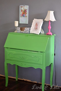
I recently joined the Houzz community--great fun over there, by the way--and posted our pre-move renovations over there. We got a lot of kind comments, just a couple "you ruined its" and "that furniture is hideous" posts. Mostly kind things, but it's fine, I can take the criticism too. I'm a big believer in showing yourself in your decorating, and in that way it shouldn't appeal to everybody. My sister and I recently had a discussion on how Pottery Barn-style catalog-imitating decorating can sometimes look so "soulless". Put your soul into your home! Just be okay with the fact that not everyone is going to like it as you do.
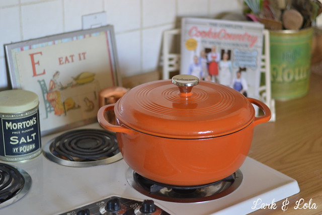
Speaking of fresh color, my mom got us a Lodge enamel stock pot as a housewarming gift! I couldn't decide which color, so I told her to surprise me. She picked Pumpkin. I love it. We've always wanted a Le Creuset--and have lusted after them many a time while watching Cook's Country--but then after reading this post I learned: the only difference between a Lodge and a Le Creuset is $230. Anyway, love the color of the Lodge and the flashy updated metal knob.
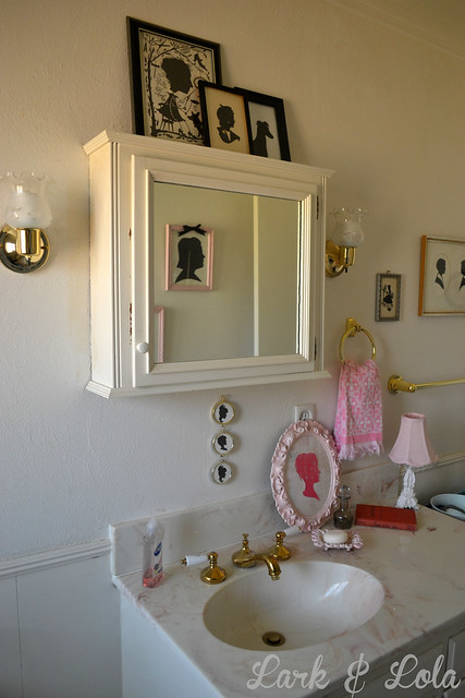
Here's one room, again with that bathroom, where I just can't manage the color. I mean, how do you deal with yellowed window inserts, a pink toilet, and pink and white swirled sink? It's not me. I threw my silhouette collection in there for now {though truth be told, I'm growing tired of silhouettes}. I'm just going to sit on my pink toilet until the time for some real $change$ comes.
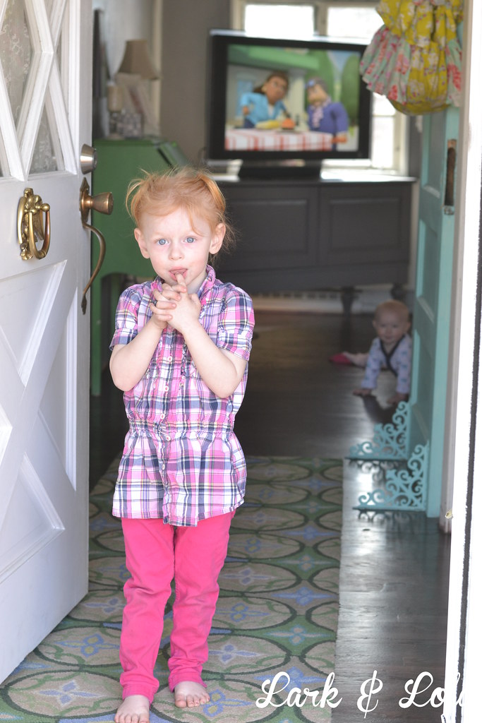
Most important of all, the people who live here look good to me too. Like my Violet, with her red hair and blue eyes. She pops.
Your style reflects you, what color schemes do you have going in your house? There is no wrong answer, so tell me! Or better yet, show me. Do a color post.
Cheers,
Heather


5 *´¯`* ℓσvεℓү cσммεηтs *´¯`*
Dear Blogger,
ReplyDeleteI love the new paint colors.
My hubby loves black furniture. I love quilts full of color, crazy throw pillows, granny square everything. I want to respect both color and the clean look of black. Help!
Sincerely,
Mrs I'll Compromise For That Man Any Day
I love all the colors! That teal is gorgeous! We just painted our bathroom a light grey, and painted our bathroom vanity a dark grey. I loove grey so much, and now I'm stuck trying to figure out what colors I want to put it there.
ReplyDeleteMy kitchen is all turquoise/aqua and red. I love it.
xo,
Kay
www.whitetrashfairytale.com
I really love your teal wall color! I also went with a similar color in my new dining room and I'm so pleased with it! The color I used is called Blue Nile and it's so cheerful and looks so lovely with all of my Pyrex.
ReplyDeleteThanks for sharing your beautiful colors!
-Beth
morepyrexplease.blogspot.com
I don't know why, but grey just makes me feel relaxed. Thanks for the tips!
ReplyDeleteHi! I've been following your site for a long time now and finally got the courage to go ahead and give you a shout out from Austin Tx! Just wanted to mention keep up the fantastic work!
ReplyDeleteLark & Lola love hearing from you!